
No products in the cart.
Color drives emotion, sharpens brand recognition, and connects your message to culture. Color trends capture more than style—they reveal shifts in culture, consumer preferences, and new directions in design, giving brands a strategic resource for decision-making.
Understanding upcoming trends isn’t about blindly following what’s popular. It’s about seeing where the collective mood is shifting so you can position your brand strategically. These industry forecasts provide a glimpse into the emotional landscape of 2026, offering tools to build deeper connections through color. And remember, just because a color is trending doesn’t mean you have to use it exclusively. You can always pair it with other hues to bring a more balanced and interesting palette.
Pantone: Cloud Dancer

Pantone’s Color of the Year is probably the most well-known or anticipated color trend announcement. And it always brings a mixture of excitement and debate. When Pantone introduced “Cloud Dancer,” an off-white hue, for 2026, the reaction was no different. Amidst economic uncertainty and societal challenges, some found the choice disappointing. But what if the message isn’t in the color itself, but in the space it creates?
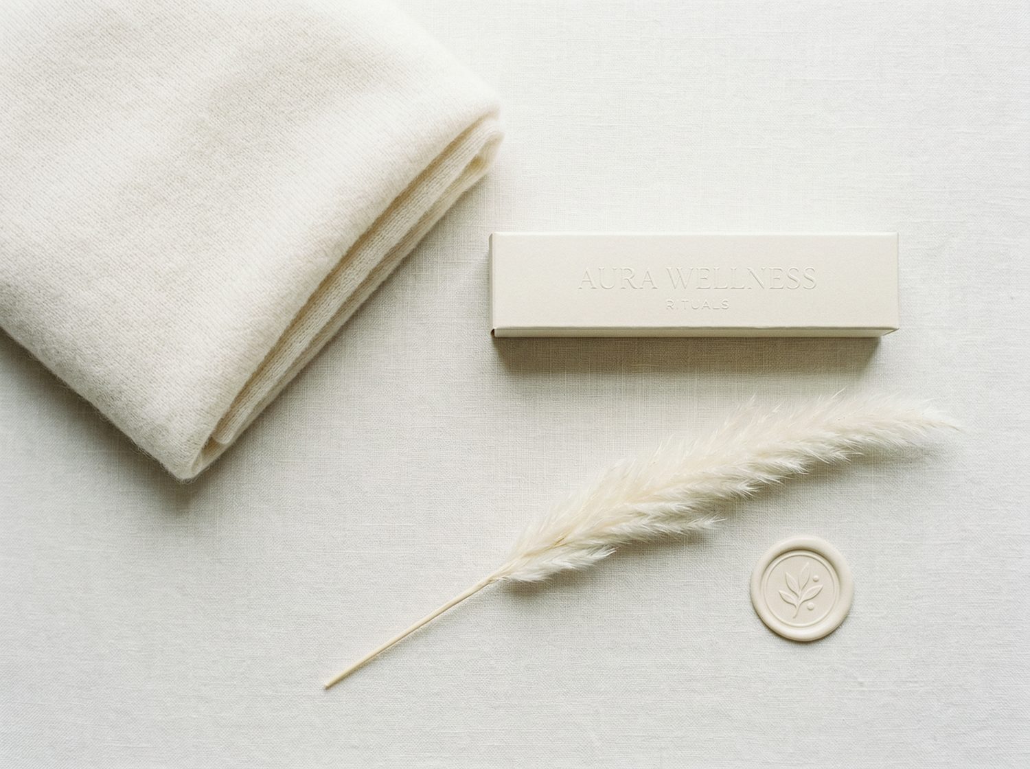
Not long ago, the industry was saturated with the energy of colors like Viva Magenta. Now, the pendulum swings toward softer, more muted tones. This shift highlights a society searching for calm in a chaotic world and shows how color trends often follow cyclical patterns. This is where the true potential of Cloud Dancer reveals itself. Think of it not as a lack of color, but as a blank canvas—a strategic decision to allow a brand’s character to take center stage. This off-white hue isn’t meant to lead—it’s meant to empower. It provides a foundation that allows you to write your own story by pairing it with colors that align with your core values.
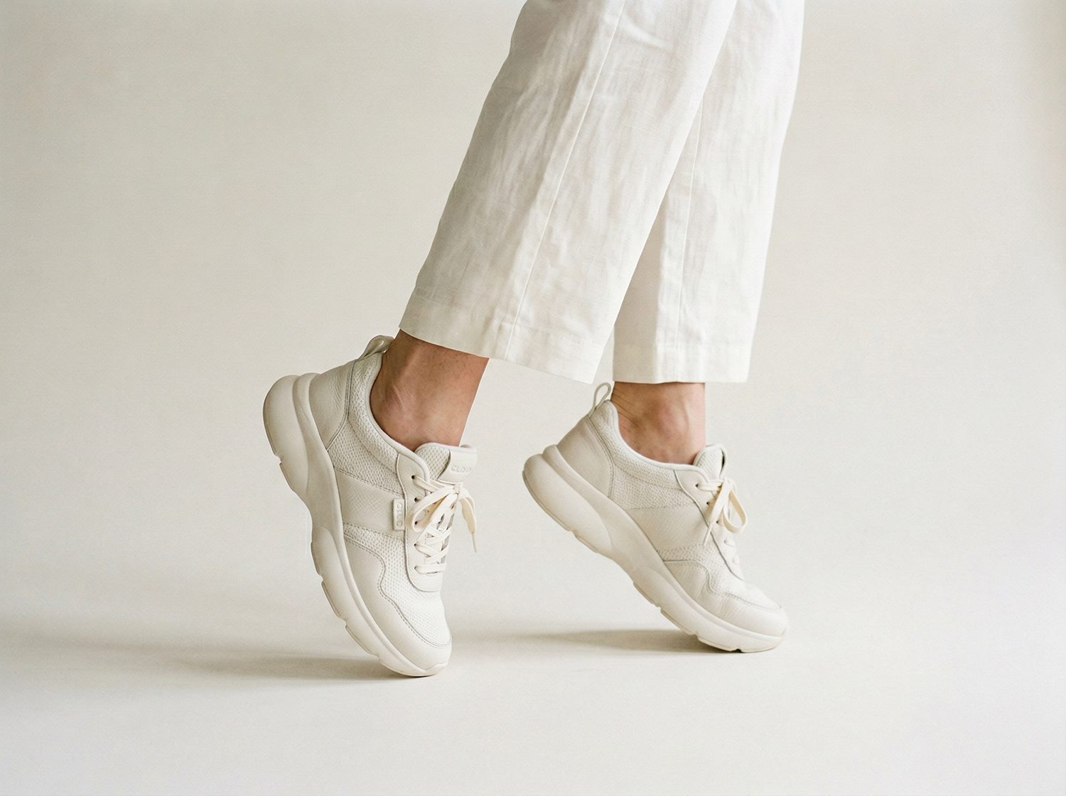
Where you may see this hue:
- Fashion and apparel (especially as a neutral base that works across all seasons)
- Textile design and home furnishings mixed with pops of color
- Packaging design for luxury or wellness products (You will likely see more blind embossing print finishes )
- Digital interfaces and app design (as background that is an alternate to pure white)
- Brand identity systems seeking flexibility (can easily be paired with bold hues, other neutrals, or pastels)
Behr: Hidden Gem N430-6A
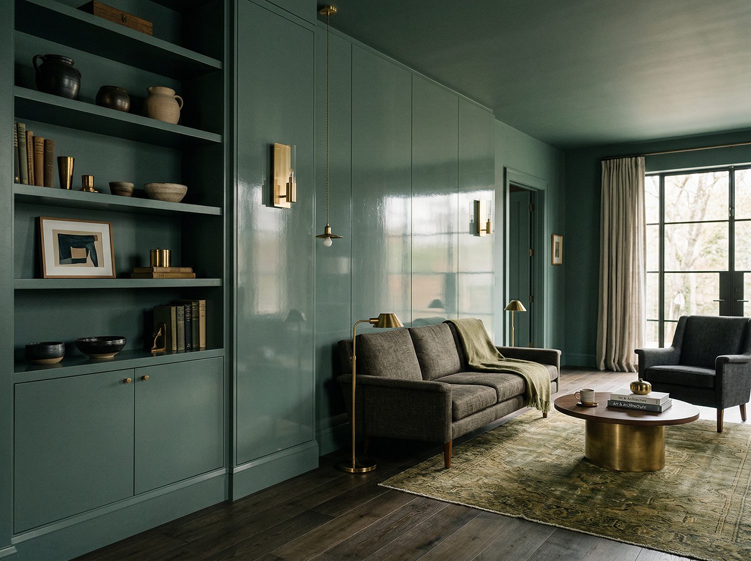
A smoky jade that balances mystery with approachability, Hidden Gem is perfect for brands looking to communicate quiet confidence. Its grounded nature makes it an excellent choice for creating spaces or campaigns that feel stabilizing yet sophisticated, inviting your audience to linger a little longer.
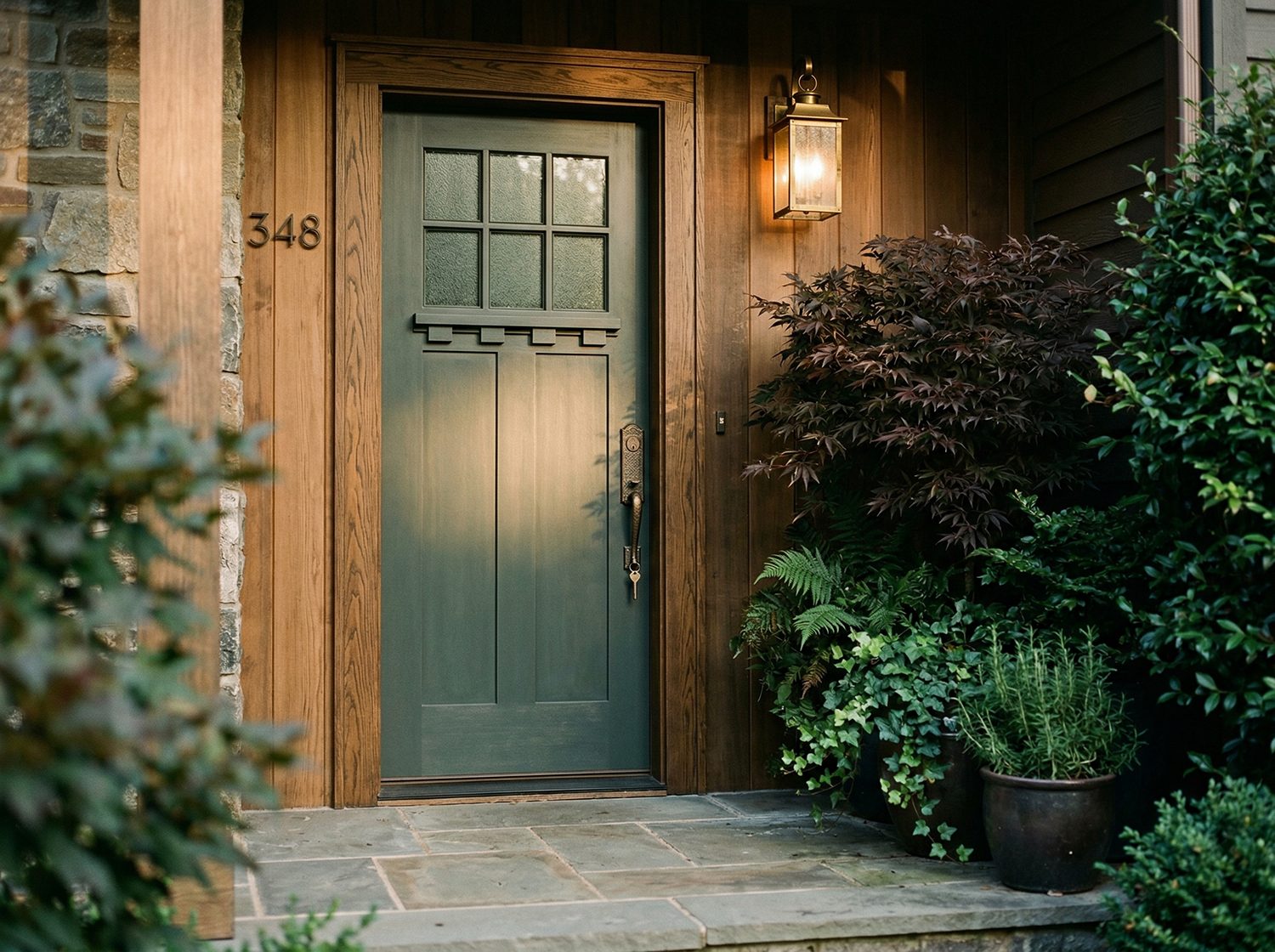
Where you may see this hue:
- Color blocking inside your home
- Color drenching with a mixture of different finishes from gloss to matte
- Furniture finishes
- In select outdoor areas or as your new front door color
- This hue was created for interiors, but due to its soothing and grounding nature, it can work well with branding within print and digital spaces (you will need to color match using a color measuring tool and convert this hue for best results)
Benjamin Moore: Silhouette AF-655
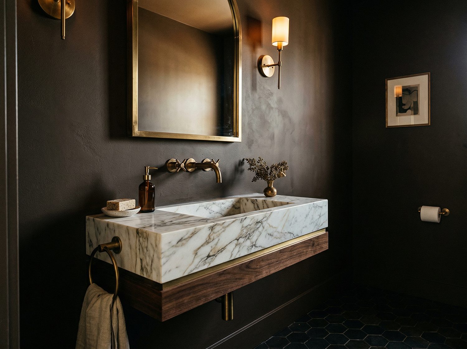
This luxurious burnt umber carries subtle charcoal undertones, offering a refined elegance that feels both timeless and modern. It works beautifully as an anchor color for brands that want to convey depth, heritage, and a sense of premium quality without feeling cold or distant.

Where you may see this hue:
- Powder rooms, living spaces
- As accent walls or as a statement wall
- Cabinetry
- Door trims or baseboards
- This hue was created for interiors, but the rich warm charcoal undertone, can work well with branding from wine packaging, luxury chocolate, and environmentally conscious brands (you will need to color match using a color measuring tool and convert this hue for best results).
Sherwin-Williams: Universal Khaki 6150
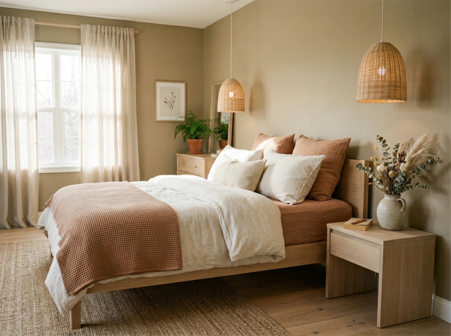
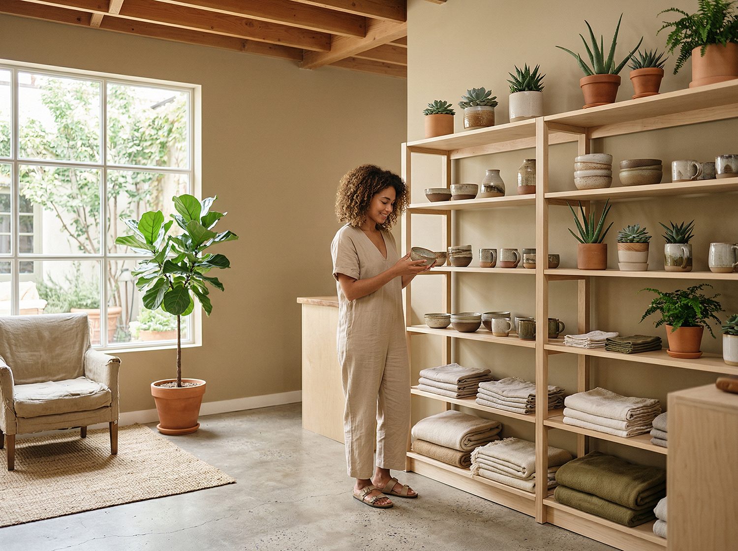
A warm, earthy neutral, Universal Khaki bridges the gap between classic comfort and contemporary minimalism. Its versatility makes it a powerful strategic tool for brands needing a reliable foundation that feels authentic and human, easily adapting to support bolder accent colors.
Where you may see this hue:
- Bedrooms and living spaces
- Outdoor areas that focus on balance and minimailsm
- Accent pieces like pottery and furniture finishes
- Offices, stores, or spaces that focus on sustainable living
3 Steps to Start Using Color Trends in Your Brand
Trends should support your brand’s character, not define it. Use this checklist to move beyond guesswork and start applying color trends strategically.
Step 1: Align Trends with Your Core
Before mixing a new color into your palette, make sure it aligns with your brand’s core message.
- Audit your current foundation. Look at your existing primary colors. Do they have space to breathe alongside the 2026 trends, or will they clash?
- Select with intention. Choose 1–2 trend colors that amplify your message rather than overpowering your established identity.
- Check the values. Ask yourself if this color represents the character of your business. If a trend feels off-brand, trust your gut and skip it.
Step 2: Test the Emotional Connection
Color is a universal language tied to emotion and culture. Verify your new colors resonate with your audience.
- Review the psychology. Refer to the guide to understand the specific emotions these 2026 hues trigger. Do they match the feeling you want your audience to have?
- Consider cultural context. Think about your specific audience’s background. Does this color carry a positive meaning in their culture?
- Run a “Micro-Test.” Don’t overhaul everything yet. Create a small sample of how the new color could look on a social post, email banner, or blog. Then, share it with a trusted focus group or some of your current clients and ask them how the content makes them feel. Focus on the emotions it evokes rather than simply whether they like the color.
Step 3: Implement Strategically
Great branding relies on systems. Roll out your updates strategically to build recognition and trust.
- Update specific touchpoints. Refresh actionable assets, like social media covers, templates, or newsletter headers.
- Use color for impact. Apply the trend color specifically to Call-to-Action buttons or key headlines to guide the eye. The new color doesn’t have to take center stage, it just needs to support your brand ethos.
- Monitor engagement. Watch your metrics. Did the post with the new color perform better? Use that data to decide if the color stays.
Ready to apply these trends to your brand strategy? We explore the psychology and cultural impact of these colors in our full Color Trends Course out soon! Grab your spot on the waitlist now.

