Client:
FordMomentum! (for Kinder Institute and Harris County)
Project components:
Brandmark and submarks System
Brand strategy
Brand archetypes and stylescapes
Color psychology
Brand guidelines
Illustration series
Creative direction
Collaborators:
FordMomentum!
Asakura Robinson
Nicte Creative Design
DLA Design
Edwidge Pierre
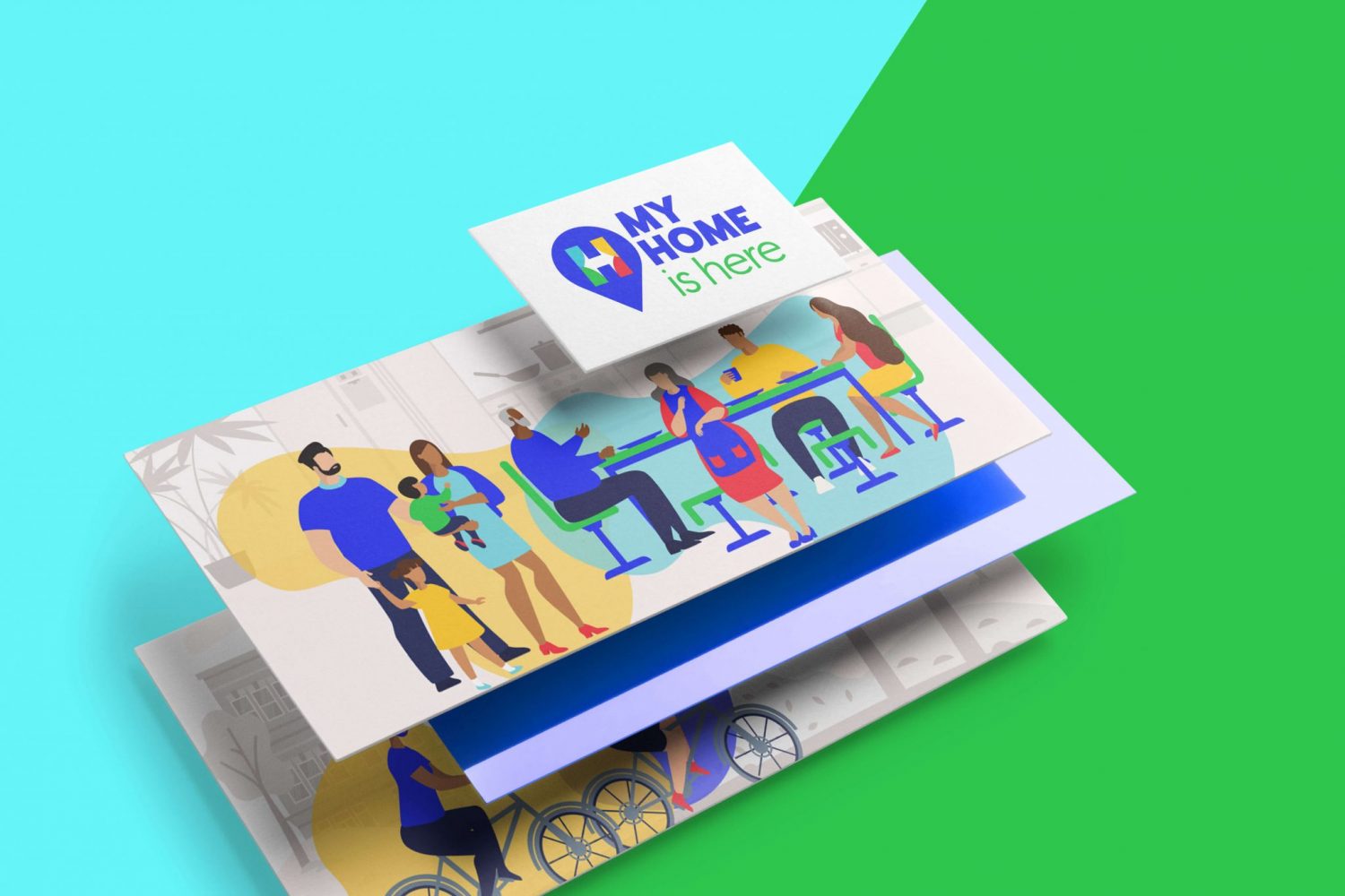
My Home is Here is a study developed to gather informed decisions about the impact of safe and affordable homes and apartments in the Harris County community. The primary goal was to develop a brand that was more than a campaign — it needed to be a brand that connected with the residents especially marginalized communities. FordMomentum! reached out to us because of our expertise in building brands and visual communication that relates to diverse communities. We worked together to develop a comprehensive brand vision that allowed Harris County and the Kinder Institute for Urban Research to continually use this brand as a community connector for future surveys.
Our project consisted of developing a primary My Home is Here brandmark and 4 cultural sub-marks that connect with specific cultural communities in Harris County. To support the brand activation needs, we also included 30 narrative scenes that were used across advertising, community activations, signage, and an animated campaign video.
Animation by Bent Image Lab
ABOUT THE SURVEY:
This $4 million study was designed to gather feedback from nearly 18,000 residents. The results informed safe housing access, community impact, infrastructure, and work through 2030. Commissioned by Harris County and conducted by the Kinder Institute for Urban Research.
Our Methodology
My Home is Here messaging is built upon a five-pillar methodology, developed by FordMomentum!, Standard of LOVE (STOLO): Literacy, Values, Self-Esteem, Economic Power, and Justice. These pillars provide direction for communicators to create dynamic opportunities for individual and community reflection, connection, and sustainable growth. The brand posits that service to others isn’t about us; it’s about others. To guide our audience in the process of identifying and articulating how we can serve them, we follow a 3‑step storytelling technique — tell them who we are, tell them who they are, and tell them who we can be together. Our narrative arc guides audiences through a process of change, from individual to co-creator in the future they want.
The Brandmark System
As the population grows in Harris County, we continually see cultural demographics shifting across the map. My Home is Here brandmark reflects our diverse population coming together as a unified mark. Each stem of the letter H represents the cultural communities our study wanted to connect with the most. We used cultural color psychology to create connections relatable to each of the four market demographics.

Visionary Green is intended to capture all residents who reside in Harris County. Usually, these are the folks who say, “I’m an American.” They value trust, predictable outcomes, protecting and improving their resources, and self-preservation. They cross party lines, are represented in each ethnic group, and are invested in Texas. Harris County is where
their home is. They have been impacted by environmental and economic shocks and seek to be a part of the solution.

Aqua Blue represents the Hispanic/Latino cultural values of flowing with gentleness, compassion, faithfulness to open skies, and leveraging the contextual nature of the Spanish language to express what English doesn’t do. Most Hispanics and Latinos in the United States are indigenous to the Americas (North, Central, and South). Their genealogy traces back to pre-Spanish colonization and carries customs, foods, and language that transcend socio-political boundaries.

Sunshine Yellow connects with a gold hue used in Black/ African American cultures — inspiring hope, greater things on the horizon, and generational strength built through shared trauma. While the majority of the Black population in Harris County is comprised of African Americans, other traditional colors, like purple (royalty), red (power),
and black (unity) can imply fraternity/sorority alignment, exclude foreign-born Blacks (Africans, West Indians, Central/South Americans), or trigger sentiments that are historically uncollaborative.

Dynamic Red is a highly regarded color representing prosperity, strength, and authority in many Asian cultures. Acknowledgment of the complexities of the diverse Asian nations represented in Harris County shows respect. Also, using color to invite them to share their views as individuals allows us to understand their needs better.

