
Client:
Dr. Joseph E. Woodzie
Davidson College
Johnson C. Smith University
Project components:
Brandmark system
Brand strategy
Color psychology
Pattern design
Brand style guide
T‑Shirt design
Creative direction
Collaborators:
Lonna Dawson
(Brand language and message mapping)
Smith Davidson Leadership Initiative (SDLI) recruits, selects, and teaches Johnson C. Smith University and Davidson College students how to become leaders who make a disproportionate impact in the life of a city. The program uses Charlotte, North Carolina, as training grounds to teach students about challenges that all cities face.
After several failed attempts to work with other designers who couldn’t capture their brand intention — rooted in empowering communities of color- Dr. Ewoodzie reached out to NCD to develop their brand identity. The concepts they had received had misaligned renditions of brandmarks with Adinkra-infused heritage where the symbolism behind them was lost.
SDLI is more than a brand, it’s an experience whose mission is about the people for the people — bringing humanity and change for communities of color across our nation. We developed an intentional brand identity that reflected, amplified, and honored the impact communities of color can create in their cities.
Our Methodology
It was important that the program didn’t end up with a generic brand — lost without its intrinsic cultural values. We developed a brand that celebrated cultural identities and harnessed the power of color psychology to amplify their communication and program directives.
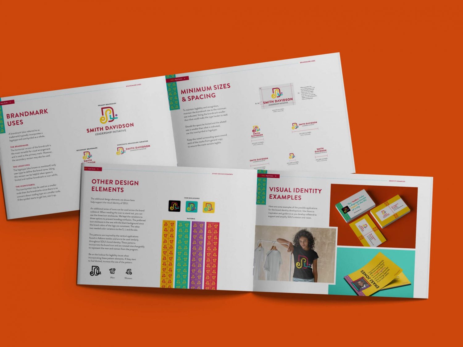
Dr. Ewoodzie wanted to develop a brand identity inspired by his Ghanan heritage — specifically the Adinkra symbols. We carefully studied Adinkra symbols and how each had historical meaning and rich traditions in pattern making. Pulling from the idea of stamping using calabash, we developed a mark that incorporates the program’s initials and would work together as a pattern. The pattern became a stylized symbol of the men and women in the program when flipped around.
We rooted our approach with the symbolism of color and heritage to help the program connect and attract future leaders of color to the program.