
Client:
Tu Eco
Project components:
Brandmark system
Brand strategy
Brand voice + messaging
Brand archetypes and stylescapes
Cultural color psychology
Identity system
Brand guidelines
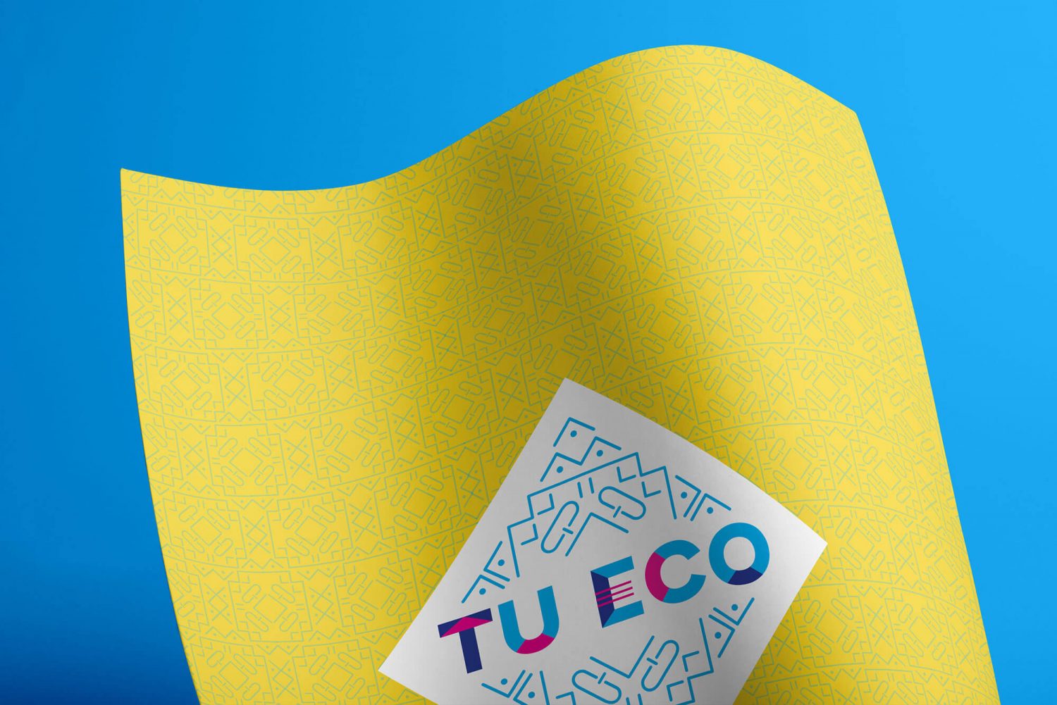
Pattern design
Cover folder design
Notepad design
Social media templates
Event signage
Slide deck template
Awards:
GDUSA American Graphic Design Awards

Tu Eco is committed to empowering the Hispanic/Latino community in San Antonio, Texas through personal growth workshops, seminars, and conferences in Spanish. Tu Eco sought a rebrand from a company that not only spoke Spanish — they needed to truly understand the Hispanic/Latino heritage. They reached out to us to help define their brand messaging, strategy and to create a brand identity design that was cohesive and truly aligned with the local community.
Our Methodology
Our goal with the Tu Eco rebrand was to capture the vibrant and energetic essence of the predominantly Mexican culture of San Antonio— without the cliche cultural misappropriation. We defined their brand messaging along with strategies on how to connect with the local Hispanic community at an emotional level.
The end result was a design inspired by the organic, yet structured forms of Aztec art — paired with strategic use of color that enhanced the transformational experience that Tu Eco cultivates. Each design element had a pyramid reference that not only connected to the structures, it also indicated direction and growth.