Let’s be honest, making your brand stand out from the crowd is a challenge. We carefully plan our content to impact and attract our audience. While our copy may be very valuable, we will always be attracted to visuals first. If we are able to peak interest, then, people will want to know more.
Design mistakes to avoid on social Media
Design mistakes can cause our audience to lose interest very quick. Why? Because our visuals can often confuse them. And that’s not helpful when you have dedicated so much time to generate compelling content! There is hope though. We want to empower you with ways you can easily prevent this! You CAN improve your visual communication by avoiding these design mistakes on social media.
1. Oh, So Many Fonts
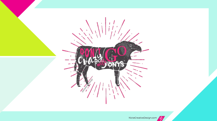
This is one of the most common and mistakes! If your copy mentions the importance of organization, strategy, clarity, structure… and so on, you must back it up with visuals. Stick to 3 or less fonts. Too many fonts create visual clutter. Random font selection results in random results. Just like this eagle cow below. When fonts don’t compliment each other, they will fight for attention. And in the end, they overshadow the importance of your content.

2. No Visual Hierarchy
When creating your social media graphics, consider including only the most important copy. You want to guide your viewers with the copy you want them to read first, second and so on. To achieve this, make it a great reading experience by using different text sizes. But don’t over do it. You can learn more about that on our typography tips for marketing post.
3. Color Contrast Issues
The reading experience we create can have a big impact. If people have a hard time reading our content, they will move on. When placing our text over solid color backgrounds, make sure that it is easy to read. If you see some sort of visual vibration around the letters, that means your background is around the same intensity as the type. This makes your text very hard to read.
If you encounter this situation, try changing the one of the colors to a darker or lighter version. A simple color change will make all the difference. When you feel it’s easy to read, so will your audience.
4. Confusing Visuals
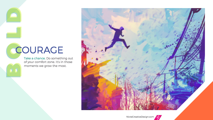
Photography and illustrations are visual assets you can use to drive your message. If a brand is all about empowering and lifting others, using dark, moody photographs/illustrations will not align with the message. As a matter of fact, it can completely change the tone of your copy.

When creating your visual content, consider the impact confusing visuals can have. Let’s say we wanted to be bold and edgy. And we change the above image to a darker one, thinking it could help encourage others to have bold courage.

A simple change where the image is darker, completely changes the tone.
Do you still feel encouraged after the changes below? The muted image feels washed out and certainly makes it scary to take a change into something out of our comfort zone. This is a simple change you can consider as you design your content for social media.
5. Too Much Copy
We all want to share our brand story. However, too much text in a small graphic is one of the most common design mistakes in social media. It can be easy to get excited about what we want to share. But remember we want to captivate our audience, not overwhelm them. As you create your graphics, give your audience a sentence, or two, that peaks enough interest for them to want to learn more. If you need to share more, use that on the caption of your post.
Now that you know what design mistakes to avoid on social media, your content is set to stand out and have higher chances of engagement. All the hard work you put towards your content creation will pay off as you apply these strategies when designing your social media content.
If you know anyone that would benefit from this blog post, we’d love it if you share it with them!


