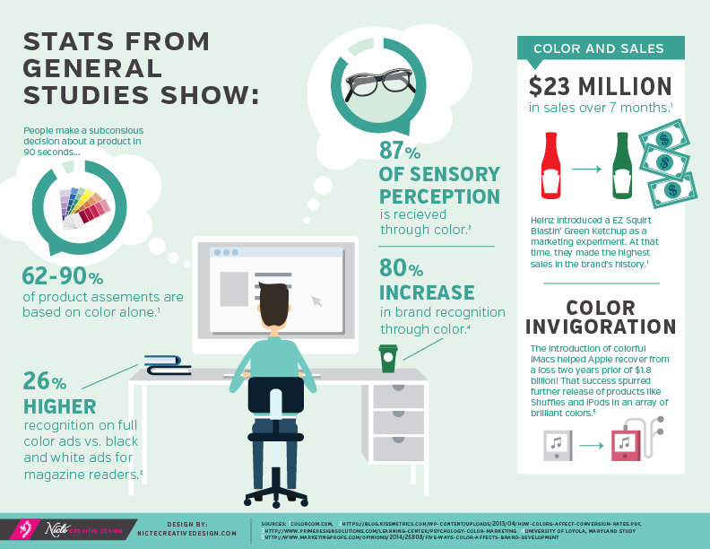
We know people are deeply affected and influenced by color — both psychologically and emotionally. Color has meanings that come from the past, but also evolve into new ones as trends may shift based on regional and popular culture. Because color registers with it’s viewer more profoundly than any other element of branding, the more consistency with which you use your brand color, the more you empower and build your brand recognition.

2017 Color trends that Influence consumers
1. Why Color Matters
Color is an often misunderstood and underutilized element. Color shouldn’t be selected just because it’s pretty or solely on instinct. It plays a key role in triggering a viewers’ psychological and emotional response.
Color defines personality, mood and feeling. Context is key. For example, Whole Foods and Starbucks use green to connect their brand personality trait about healthy living. Both brands are very intentional about their food/product sourcing and use this color to support it as well as to connect that message with their audience. If they chose to use gray, they would not only lose brand essence BIG time, but profoundly change what they are communicating, i.e.: healthy living or ethically sourced/sustained products do not align with a gray color.

2. Brand Recognition Through Color
We can easily recognize several brands based on their color. What color do you associate in your minds eye when you think of these well known brands: Target. Girl Scouts. Twitter. Sprint. Chances are you saw red, green, blue and yellow… and when you read this list, did you also find yourself spontaneously “seeing” the Target, Girl Scouts, Twitter or Sprint logos in your mind’s eye? If so, that was simply from the mention of color! There could be no more profound example of what we are staying than that right there!
3. Color and Market Trends
Every color exudes a certain emotion. It’s meaning can be influenced by market trends, which reflect current cultural shifts. Each year Pantone selects a color of the year based on these shifts. These color trends influence various aspects of the market, from architecture, to fashion, to graphic design, textiles and interiors, as well as artists, musicians and even food. This year, the 2017 Pantone color is Greenery. It’s symbolic of new beginnings and connects with our growing need to connect back with nature or a higher purpose. Greenery is a fresh yellow-green shade that signals consumers to take a deep breath and feel reinvigorated.
With this color trend you will likely see:
- More brands adapting environmental efforts and may use green tones in their marketing to communicate it
- Emphasis on the connection we seek with nature
- Advertising that incorporates a “green” message in some form
- Rise in photography showing people enjoying the outdoors
- People leading a sustainable life as a needed life-style over a trend
Understanding these trends can help you gather some insight, but keep in mind that not all color predictions will align with your business and the emotional connection you want to achieve. Knowing the true purpose of your brand and who you are trying to reach are critical in making the right color selection for your brand.
Perhaps you are a marketing manager, an avid Instagramer, a graphic designer, blogger or a small business owner that REALLY wants to stand out — not just this year, but every year. You may not have the time to research what color trends are, what emotions they can evoke, which are working or worth implementing, make sure you download Nicte Creative Design’s Annual 2017 Color Trends Guidebook.


This post is SPOT ON! My husband and I were just having a friendly debate over having more color on the homepage of our new site — I hope this helps as a tie-breaker in my favor! 😉
Choosing a color for your landing page is a big decision. So glad that this post was a helpful tie-breaker, Erica!
I totally saw all of those logos in my head! Very cool post!
Thanks, Melanie! Those brands do a great job creating that logo & color relationship.
Loving the green trend. This girl is all on board! Great post!
Isn’t the green so refreshing? Especially for the Emerald Coast area 😉 I’m glad to hear the post resonated so much with you.